
Editing content — the Edit tab
How to edit text, buttons, links, colors, images, icons, and every other field in the content editor.
In this guide
- 1Opening the content editor
- 2How fields are organized
- 3Text and textarea fields — live preview
- 4URL / link fields
- 5Color fields (button and background colors)
- 6Icon fields — emoji or upload your own
- 7Adding and removing items
- 8Star rating fields
- 9Text alignment controls
- 10"Suggest to AI" — send field to AI drawer
- 11Per-field formatting — bold, italic, and font
- 12Fonts for Indian and other languages
- 13Expand to full-screen editor
- 14Fix text fields and Fix image slots
Opening the content editor
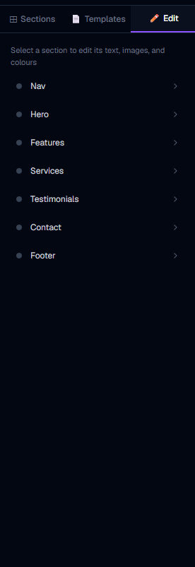
Click any section in the left panel section list, or click directly on any part of the live preview. The left panel switches to the Edit tab and shows all the editable fields for that section.
If the Edit tab is already active but shows "Nothing selected", it means no section is currently selected — click a section in the preview or the Sections tab to select one.
How fields are organized
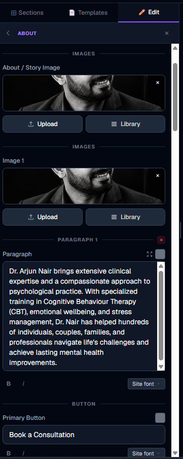
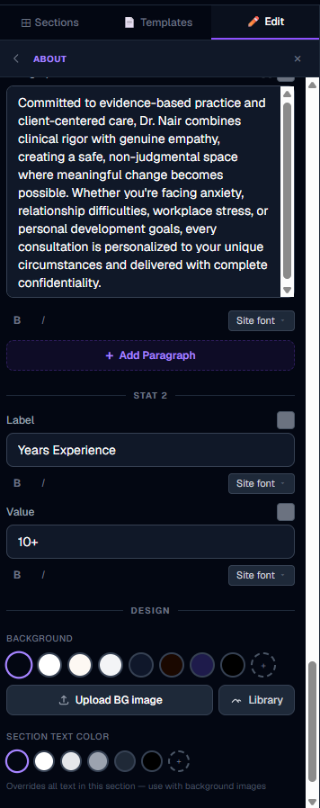
Fields are grouped by category:
Not every section has every group. A simple CTA Banner might only have Content and Button. A Services section has Content plus Item 1–3.
Fields you haven't edited yet show the AI-generated placeholder values. Just click and type to replace them.
Text and textarea fields — live preview
Type directly into any text or textarea field. The live preview updates character by character — you see your changes in real time without clicking anything.
Changes are marked as unsaved immediately and auto-saved to your draft 1.5 seconds after you stop typing. You do not need to click Save after every field — editing flows continuously.
URL / link fields
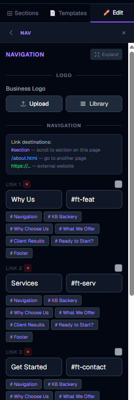
Link fields accept two types of values:
Internal anchor links — links that jump to a section on the same page. Type # and you will see a dropdown of all sections on the page, labelled by type (e.g. #contact, #services). Clicking a suggestion fills the field automatically.
Page links — links to other pages on your site. The dropdown also shows your other pages (e.g. /about.html, /contact.html).
External URLs — just type the full URL: https://yoursocial.com, https://wa.me/... etc.
The button on your live site will navigate to exactly what you type in the link field.
Color fields (button and background colors)
Color fields show a small color swatch and a hex code. Click the swatch to open the color picker and choose any color. The preview updates in real time.
These control the background color of CTA buttons and certain section backgrounds. The AI picks initial colors that match your brand — override any of them as needed.
Icon fields — emoji or upload your own
Service cards, feature cards, floating action buttons, and social buttons in footers all have Icon fields. These open a dedicated icon picker when you click on them:
Examples: 🍽️ 💇 🏥 📸 ⭐ ✓ → ◆. The icon updates in the live preview immediately.
Social media buttons in footer sections (Instagram, Facebook, WhatsApp) also use icon fields — you can swap the default emoji for your own branded icon PNG.

Adding and removing items
Sections with repeatable lists — service cards, nav links, footer links, FAQ rows, testimonial cards, gallery images, and more — show + Add and × Remove controls in the Edit tab.
To add an item: scroll to the bottom of the relevant group in the Edit tab and click + Add [item name]. A new item is created as a copy of the last one, with blank or placeholder text. Edit its fields immediately.
To remove an item: click the × Remove button next to the item you want to delete. The item is removed from the preview instantly.
This works without any AI credits — items are cloned and removed instantly.
Where you'll find add/remove controls:
Note: the Blog Preview section loads posts dynamically from your published blog — it has no manual cards to add or remove. Publish your blog posts from the Blog tab and they appear automatically.
Tip: the minimum item count is 1 — you cannot remove the last item in a group.
Star rating fields
Testimonial sections have a star rating field for each review. Click the number of stars (1–5) and the rating updates in the preview. Useful for matching the actual rating a customer gave.
Text alignment controls
Text fields marked as "alignable" show three small alignment buttons above the field: left, center, right. Click one to change the text alignment of that specific field in the preview.
This is useful for headlines (many designs look better centered on mobile) and taglines.
"Suggest to AI" — send field to AI drawer
Next to the label of most text fields, there is a small "Suggest to AI →" link. Clicking it:
This is the fastest way to ask AI to rephrase a specific piece of text. The AI will regenerate just that section with an improved version of that field.
Per-field formatting — bold, italic, and font
Every text and textarea field in the content editor has a small formatting bar just below the input:
B (Bold) — toggles bold on that specific field. Activates at the element level — only that element turns bold, not the whole section.
I (Italic) — toggles italic on that specific field.
Font picker — a compact dropdown showing all available fonts grouped by language. Choosing a font applies it only to that one field, overriding the site-wide font for just that element. Useful for giving a headline a display font while keeping body text readable.
Click "Site font" in the picker to remove a custom font and go back to the site-wide choice.
All formatting changes appear in the live preview instantly. They are saved in your draft automatically and applied to the published site when you publish.
Fonts for Indian and other languages
EasyWebie includes over 50 fonts from Google Fonts, organized into 17 language groups:
You can use them both as the site-wide font (preview toolbar → Aa font picker) and as a per-field font (formatting bar below each text field).
Google Fonts handles script subsetting automatically — it only downloads the glyphs your content actually uses, so loading Arabic or Chinese fonts does not slow down a Latin-only page.
To search for a specific font, click the font picker dropdown and type in the search box.
Expand to full-screen editor
The content editor fits inside the narrow left panel, which can feel cramped when editing sections with many fields — especially long-form content like rich text paragraphs.
Click the Expand button (two-arrows icon, top-right of the section type label) to open the entire content editor in a large centred modal that fills most of your screen.
Everything works exactly the same in the full-screen editor — all fields, formatting controls, image uploads, and AI suggestions. Changes apply live to the preview behind the modal. Click ✕ to close and return to the normal panel.
This is especially useful for the Content (Rich Text) section, which can have up to 6 paragraphs, and for any section where you need to write longer descriptions.
Fix text fields and Fix image slots
Sometimes after many AI generations, a section can develop issues:
Fix text fields — if you see placeholder text like "{{headline}}" showing up in the preview, this repairs it. AI re-scans the section HTML, finds unlinked text placeholders, and wires them up to editable fields.
Fix image slots — if image areas in a section show blank or broken, this repairs the image data-attributes so images can be managed properly.
Both of these are recovery tools — most well-generated sections will never need them.
More in Builder
Builder layout and the top bar
Understand the full builder layout — the three panels, every top-bar button, the save system, and how to navigate pages.
Managing sections — add, reorder, duplicate, delete
Everything about sections: what they are, how to add them in the right position, reorder by dragging, duplicate, delete, and change their visual style.
The AI Build & Edit drawer
How the AI chat works — generating new sections, redesigning existing ones, choosing models, using reference images, and understanding AI credits.
Media library, logo, fonts, and hero images
How to upload images and logos to the media library, set your site logo, choose fonts, and set a hero background image or video.
Power features — select mode, batch redesign, templates, shortcuts
Advanced builder techniques: select multiple sections for batch AI redesign, save custom section templates, use keyboard shortcuts, and apply full-site templates.
Managing pages in your website
How to add new pages, switch between pages, navigate internal links, and delete pages you no longer need.
Using templates smartly — get more with fewer AI credits
How to build a complete, professional website using ready-made templates without spending any AI credits — then use AI only where it matters most.
Empty Section — build any custom layout with AI or your own code
How to add a blank empty section to your page and use the AI drawer or Code Editor to turn it into any layout you can imagine — no templates, no limits.
Section Creator — build and save custom HTML/CSS sections
How to write your own HTML and CSS in the Section Creator, add editable fields with data attributes, run the AI security check, and reuse your sections across all your websites.
Section Creator — coding rules & what JavaScript is allowed
Understand exactly what HTML, CSS, and JavaScript you can use in the Section Creator — including how to write interactive components like menus, accordions, and animations correctly.
Creating new pages with AI — the complete guide
How to use the AI assistant to create full pages with sections and automatic nav wiring — including model choice, credit costs, and what to expect.
AI Assistant tips and tricks — get better results faster
Practical techniques for getting the most from the AI assistant — quick prompts, the right mode for the right job, how to save credits, and what the AI can actually do.
Save as My Template — reuse sections across all pages
How to save any section as a personal template and reuse it on any page or any website — the fastest way to keep your site consistent.